Spring 2020
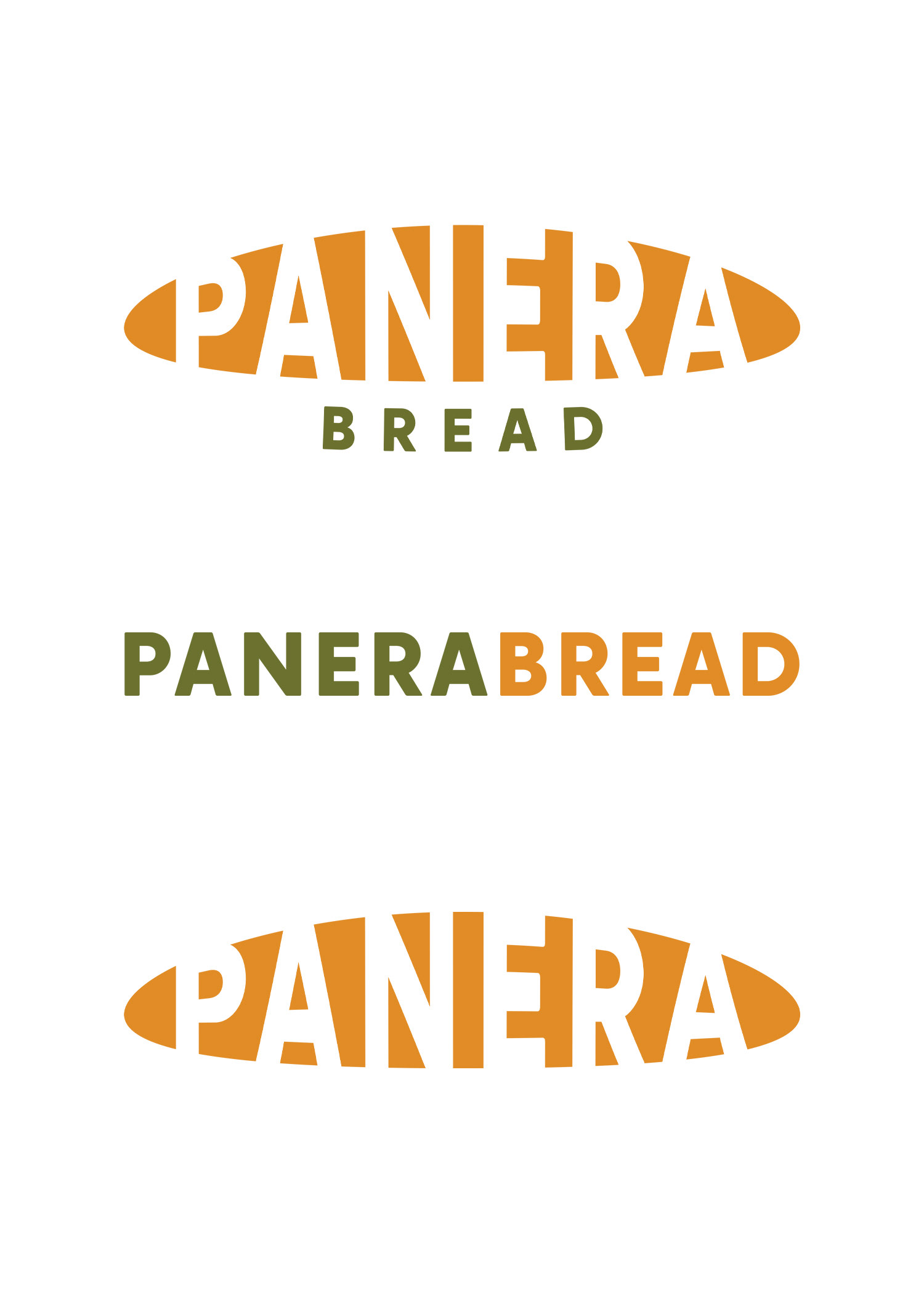
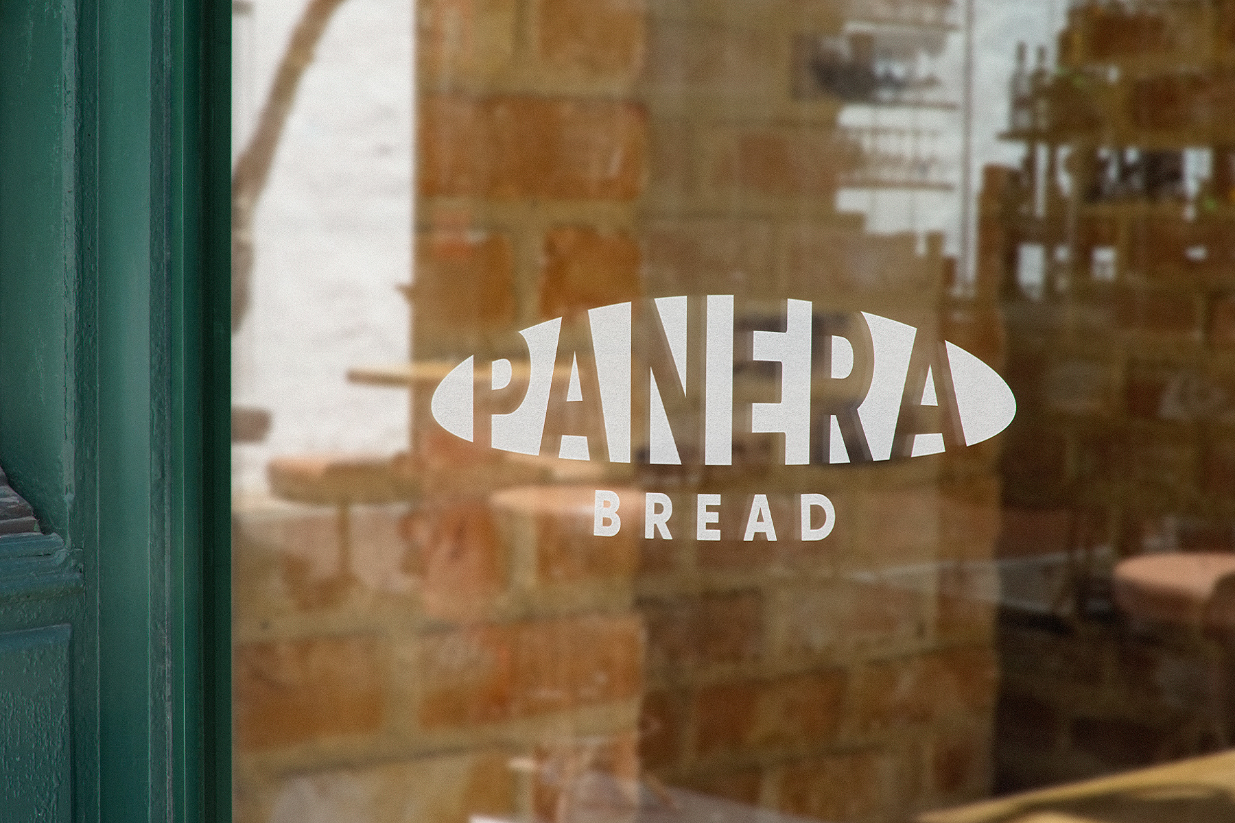
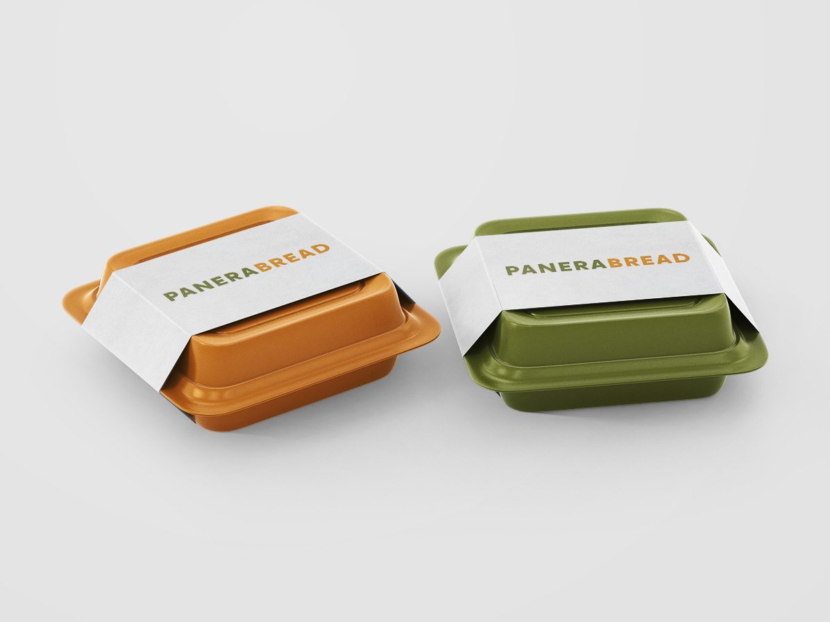
I decided to challenge myself to rebrand Panera Bread with a new minimal logo set that updates the look while still maintaining the same feel. Panera Bread's mission is to bring to life fresh ideas about living and eating well while creating a warm, welcoming environment in-store. I kept the color palette relatively the same, but brought in an orange to not only give a pop of color, but also because orange symbolizes warmth and balance (aligning with Panera Bread's values). I cut out the word "Panera" in a clean, bold, yet inviting sans serif font from a main loaf shape and added the word "Bread" beneath in green, following the curvature of the loaf. For a type-only logo, I simply used the same font and put "Panera" and "Bread" in green and orange respectively, maintaining the consistency of "Bread" being orange.
(This was an independent project, not an actual design for the company)


